

The Ubiquity Favicon: a very important question
As we get close to wrapping up Ubiquity 0.5 (currently planned to ship—fingers crossed—on Monday) one remaining issue is how to incorporate our cute new Cocoia-designed and community-produced icon, the Ubiquibot. The difficult decision is how to take this finely detailed icon and produce a 16 x 16 [[favicon]].

I came up with three different options:
Seeing them on my blog doesn’t quite compare to how they will be used, so here are some screenshots of them in context:1
Skin/command subscription
![]() Current version
Current version
![]() Option 1
Option 1
![]() Option 2
Option 2
![]() Option 3
Option 3
In Ubiquity with the Ubiquity Evolved skin
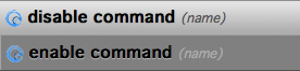 Current version
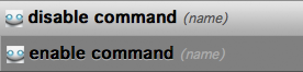 Option 1
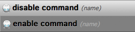 Option 2
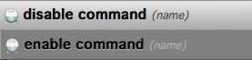 Option 3
The Poll
Please vote for your favorite option and look forward to seeing Ubiquibot in a browser near you!
(For those of you reading this through a feed reader or planet and don’t see the poll widget below, please visit the permalink to participate.)
-
For those of you who are wondering, Option 2 is just a wee bit bigger in scale than Option 3, and thus has brighter eyes but is a little cut off on top. ↩