blog

Friendlier command feed subscription

doom.png

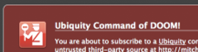
If you’ve ever subscribed to a new Ubiquity command before, you know the red screen of doom. Ubiquity currently takes users to this page every time they wish to subscribe to a new command. The current design is meant to encourage users to be aware of the possible security implications of enabling and executing a command, to avoid getting a trojan horse.

The current screen, however, does not make subscribing to commands foolproof. I personally know I’ve subscribed to a number of commands without reading through the code, defeating the purpose of the anti-trojan horse display. Moreover, the page doesn’t give you any information on how you can use this new command. Especially given the inherent limited discoverability of a natural language interface, taking a moment to help the user actually learn the command becomes key.

Today I did a quick mockup of what a friendlier command feed subscription page might look like. Take a look at this screenshot with some of the features marked:

new-subscription-page-small.png

You can also check out the page itself. If you’d like to visualize it without the “trust” warning, you can also view the trusted version.

This mockup here is but a first iteration. What do you think about this subscription page? What is missing? What should be changed?

Related posts:

  1. A Visual Guide to Community Command Localization
  2. Count command for Ubiquity
  3. Exploring Command Chaining in Ubiquity: Part 1
  4. Converting your Ubiquity command to Ubiquity 0.5
  5. Ubiquity Commands by The Numbers

Related posts brought to you by Yet Another Related Posts Plugin.

Tags: , , , , , , , , ,

If you enjoyed this post, make sure you subscribe to my RSS feed (optionally with tweets from my Twitter)!

10 Responses to “Friendlier command feed subscription”

  1. Alberto Santini Says:

    I think it is a great enhancement for taking a moment to help the user actually learn the command becomes key, but the main purpose of the red screen page is alerting the user about the possible security implications.

    The page is so nice the user might forget the risks. :)

    Mozilla, for instance, does not guarantee that the addons linked are safe, but they have been scrutinised by Mozilla and are also constantly being looked at by the wider Mozilla comunity.

    Vulnerability perception would be diminuished if the command would be retrieved by a central repository. There, the page suggested, would be very contextualized.

  2. Alejandro Moreno Says:

    Yeah, I agree with Alberto. Needz moar RED.

    Also, I prefer the term "subscribe" to a command feed. It gives me a warm fuzzy feeling that any bugfixes on the commands will be updated automatically. … Of course, if this is not what happens, then "subscribe" is a terrible choice!

  3. Alan Says:

    I like the idea of the new page, but I think the three 'zones' on the page should use the common Firefox error/warning rounded-corner boxes to make the page look more like a Firefox interface page than a usual web page.

    As we're personifying Ubiquity with the Ubiquibot, 'learn' seems the nicest verb to add commands, not least as subscribing implies future updates which I don't think Ubiquity currently offers (but am now doubting I am right…)

  4. mitcho Says:

    Alberto, Alejandro… so, I guess I made the page a little too friendly. :) I appreciate the feedback.

    Alberto, re: the security model, I'm not the best one to answer this, but the "trust" aspect of these commands is definitely something that will need further scrutiny.

  5. mitcho Says:

    Alan, you're right that this layout may not be very Firefox-y, but it's just a mockup. ^^ The amount of information on this kind of page may be more than is normally appropriate in one of those rounded corner Firefox pages, though… is there an example of a Firefox rounded box page with lots of content?

    I personally like learn but believe it's a bit confusing… is the user doing the learning or is Ubiquity learning? I do believe the "subscription" feature of feeds does work right now.

  6. Alan Says:

    Hmm, if 'subscribing' does what it says on the tin then I think that's the perfect verb and like you say is not ambiguous in nature to the user and conveys that you'll be getting updates.

    I just had a look though all the about: pages and the only ones with lots of content are about:credits and about:licence which arguably serve a different purpose. Although the current page, chrome://ubiquity/content/confirm-add-command.html, is quite long as it is. My point was that by simply using the existing dark grey page background and putting those three 'zones' in your mock-up into the rounded-corner box it would suddenly appear as a Firefox UI page over a generic web page and I think this remains true regardless of the size of the page.

  7. A Visual Guide to Community Command Localization Says:

    […] As I’ve written before about Ubiquity’s command subscription, there is much we can improve in this area of Ubiquity’s user experience. ↩ […]

  8. coupons Says:

    I like the idea of the new page very much! Thanks!

  9. voucher codes Says:

    Agreed! I also think it is a great enhancement for taking a moment to help the user actually learn the command becomes key.

  10. Buy essay Says:

    Especially given the inherent limited discoverability of a natural language interface, taking a moment to help the user actually learn the command becomes key. It is a very important tip. Thanks.


© 2006-2010 mitcho (Michael 芳貴 Erlewine).
Proudly powered by WordPress.
Entries (RSS) and Comments (RSS).
The views expressed on these pages are mine alone and do not
reflect those of my employers and clients, past and present.